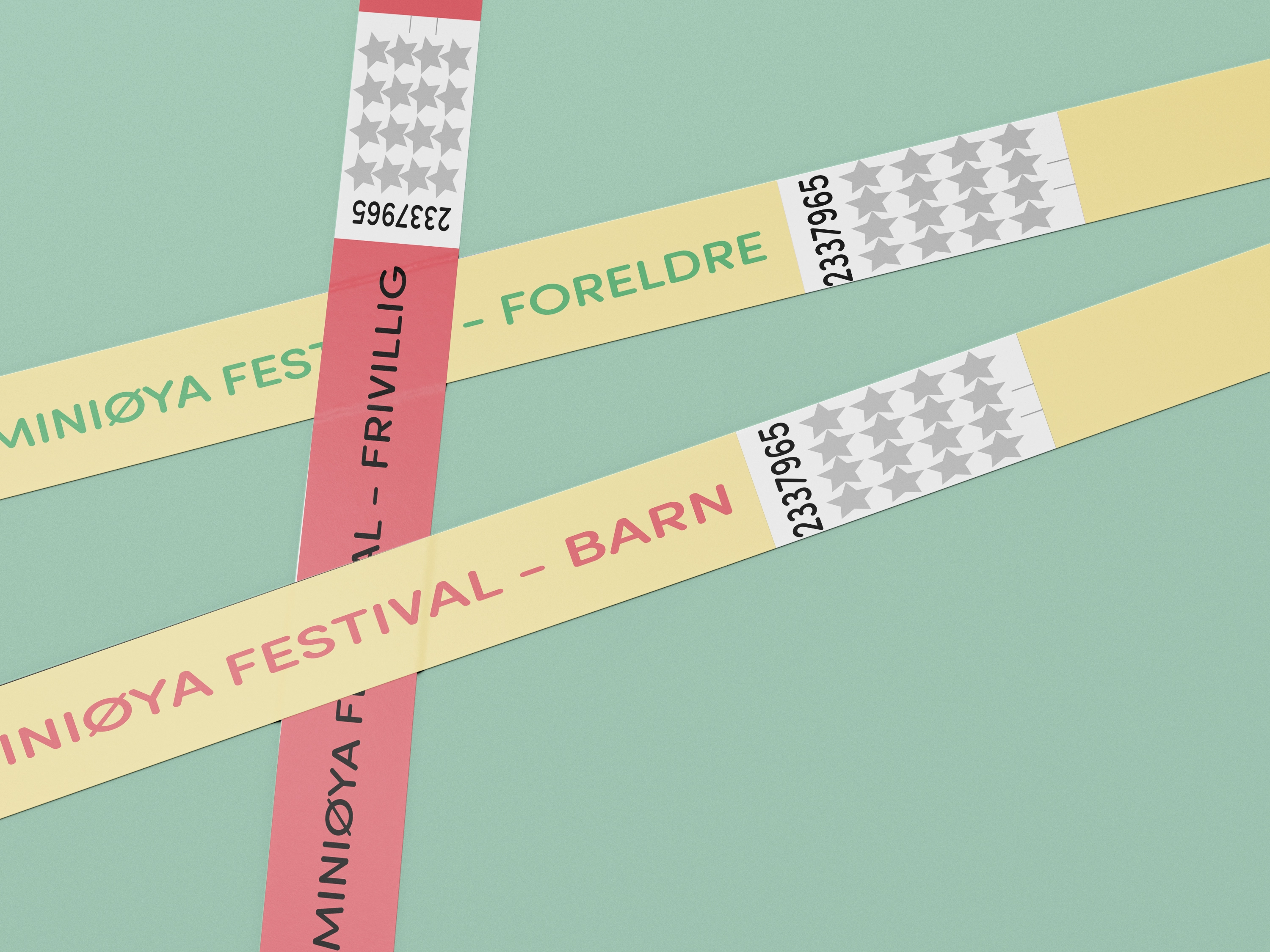
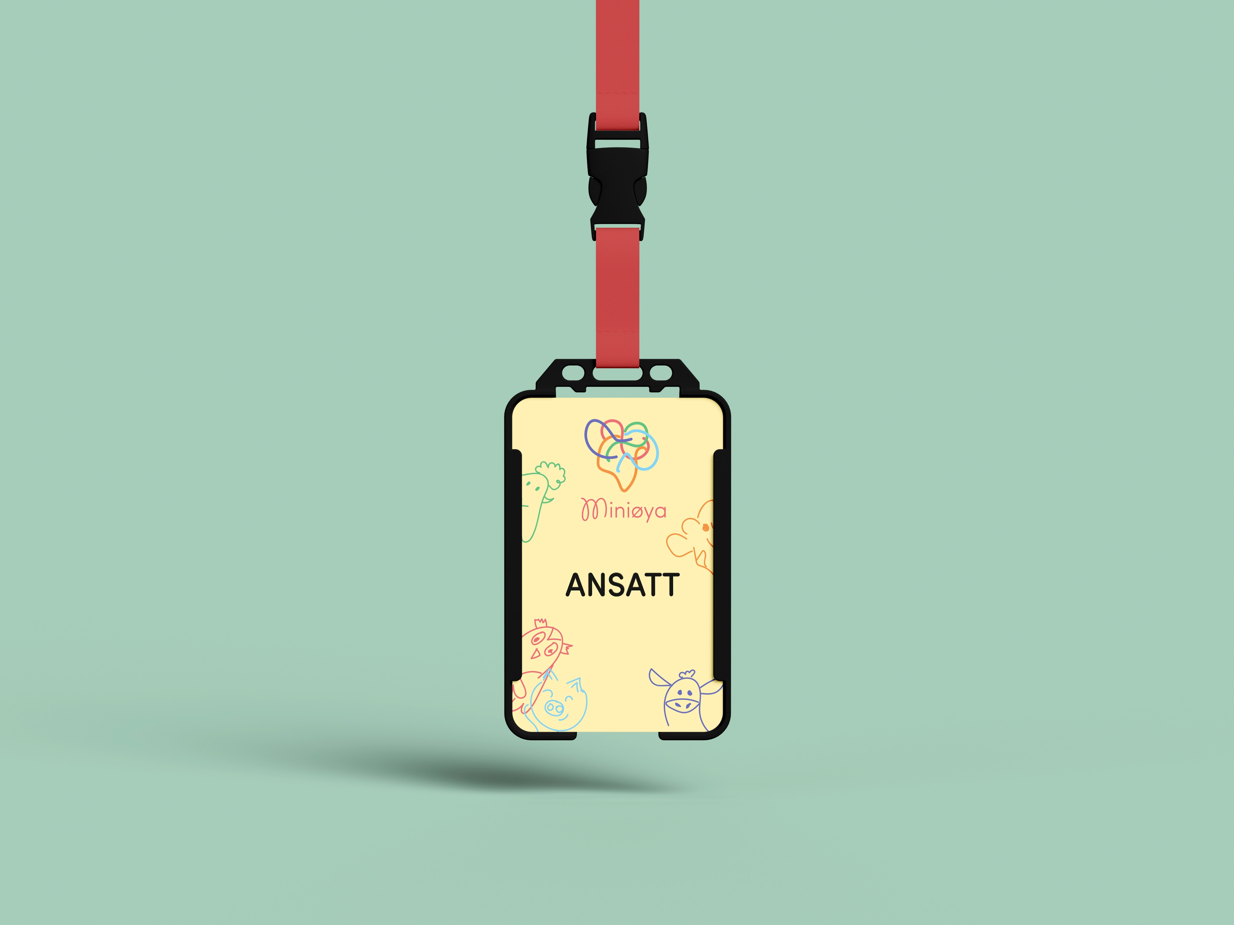
Redesign of a festival identity, as well as developing a new brand manual
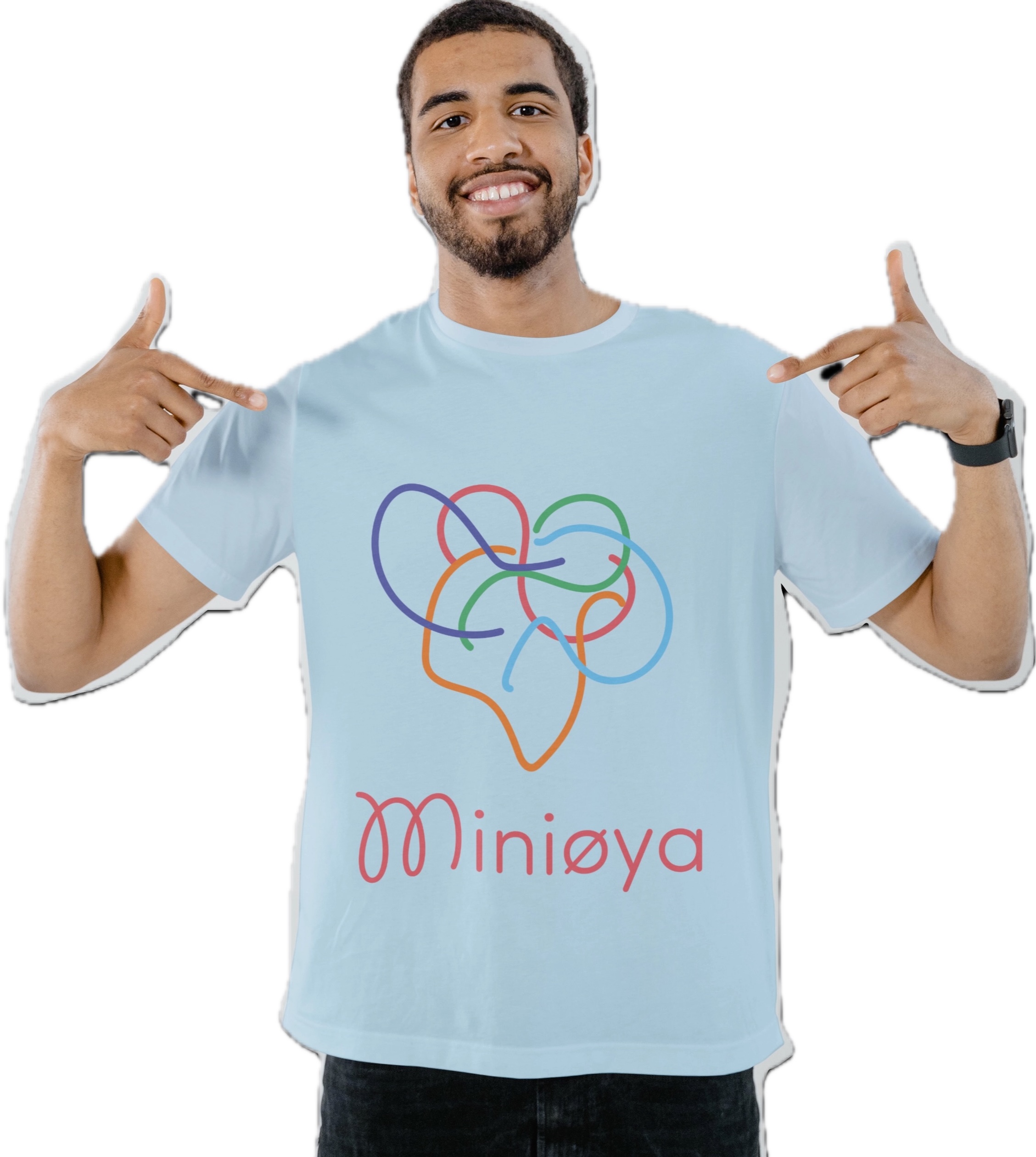
Miniøya Festival
Fresh, trendy and playful
2024
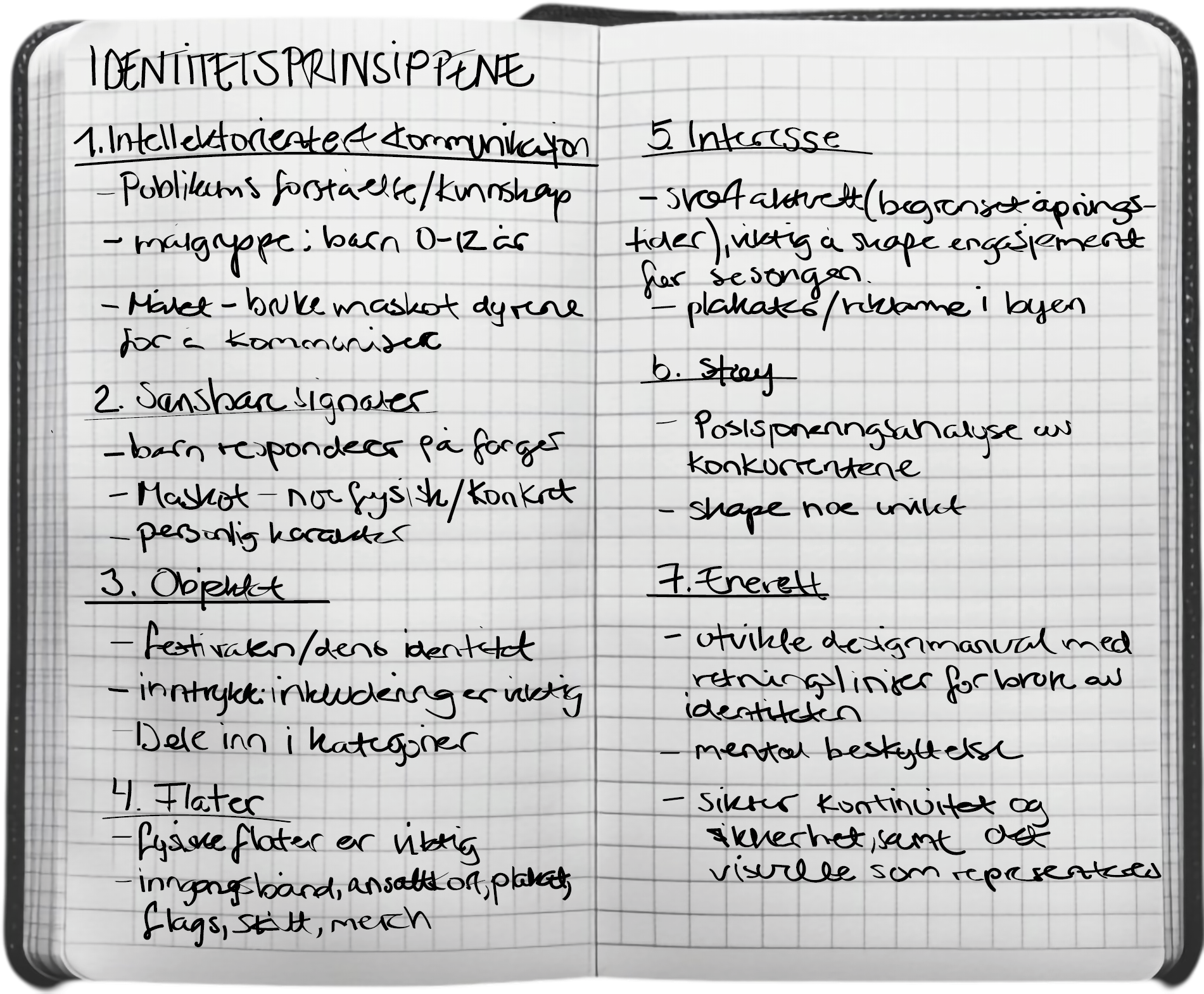
Redesign the identity for a festival with a design manual belonging to the new identity, which clearifies the regulations. The regulations should make sure that the identity appears holistic, recognizible and easy to use. The new identity should be devoloped on the basis of a strategy.
How can I create a more child-friendly identity for Miniøya, which is based on the inspiration of a childs perspective?
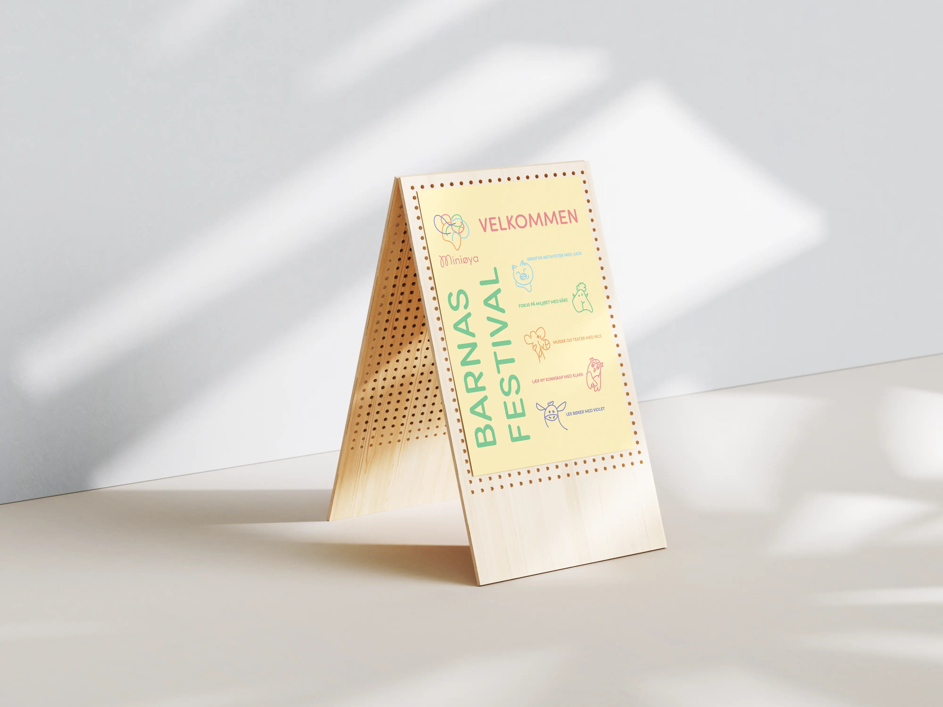

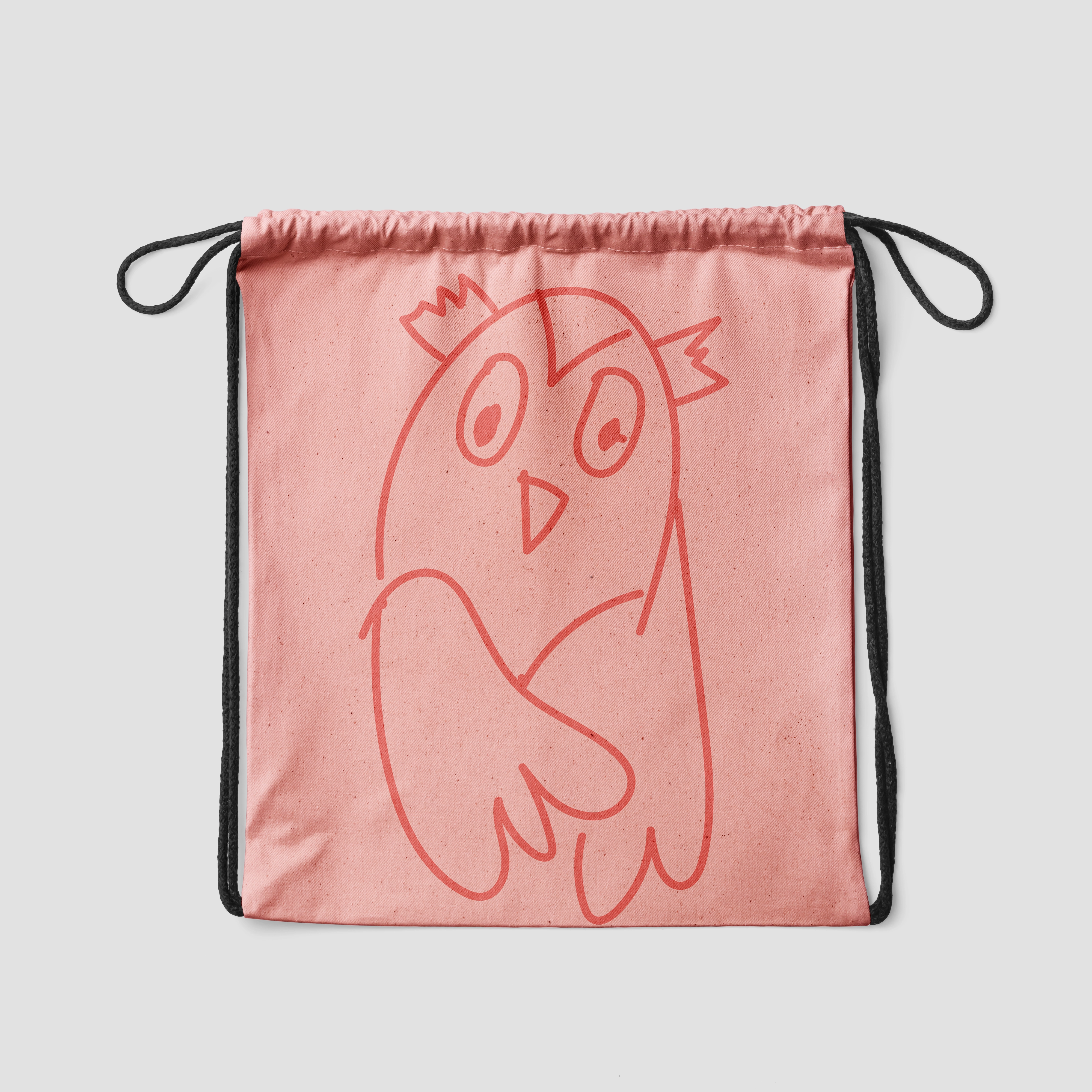
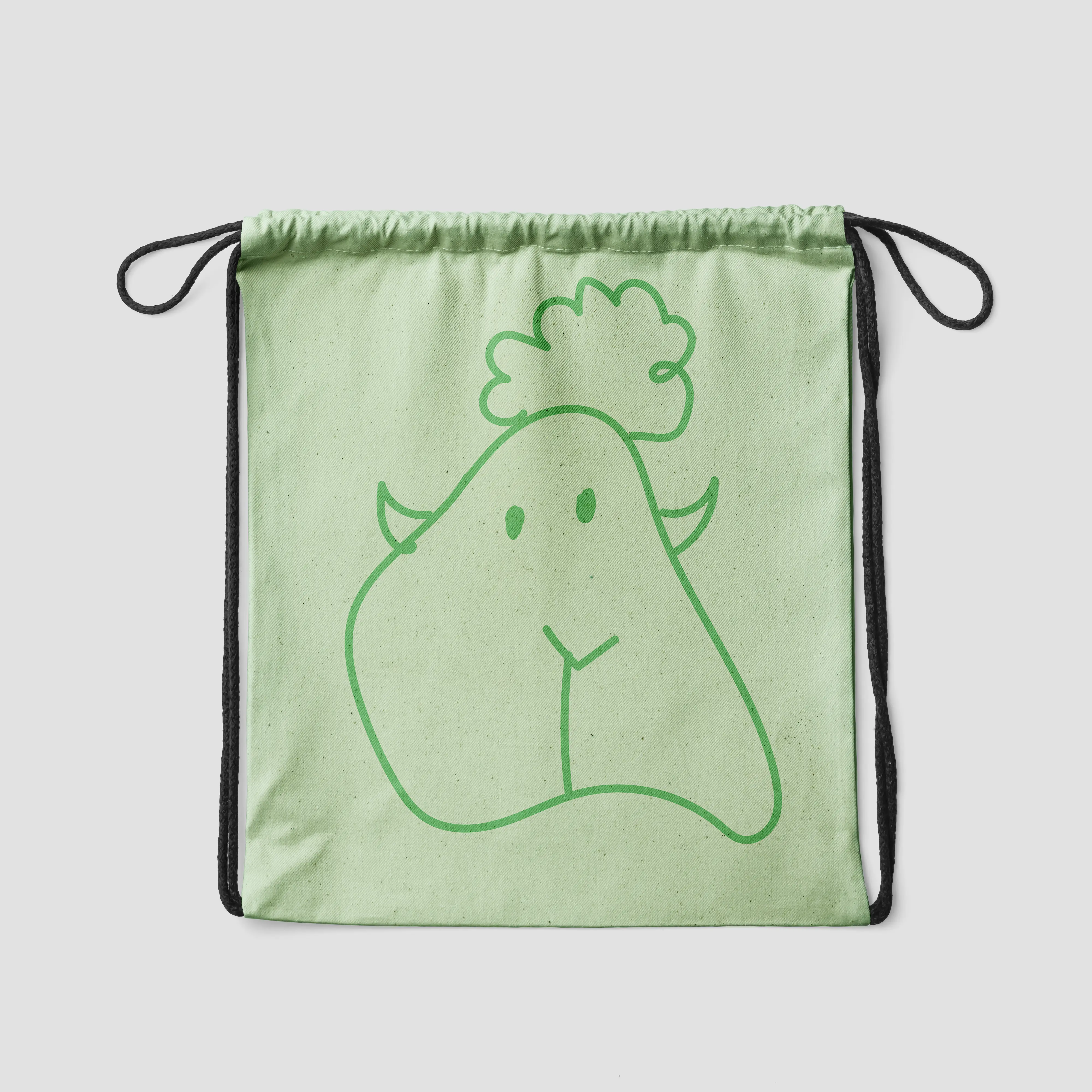
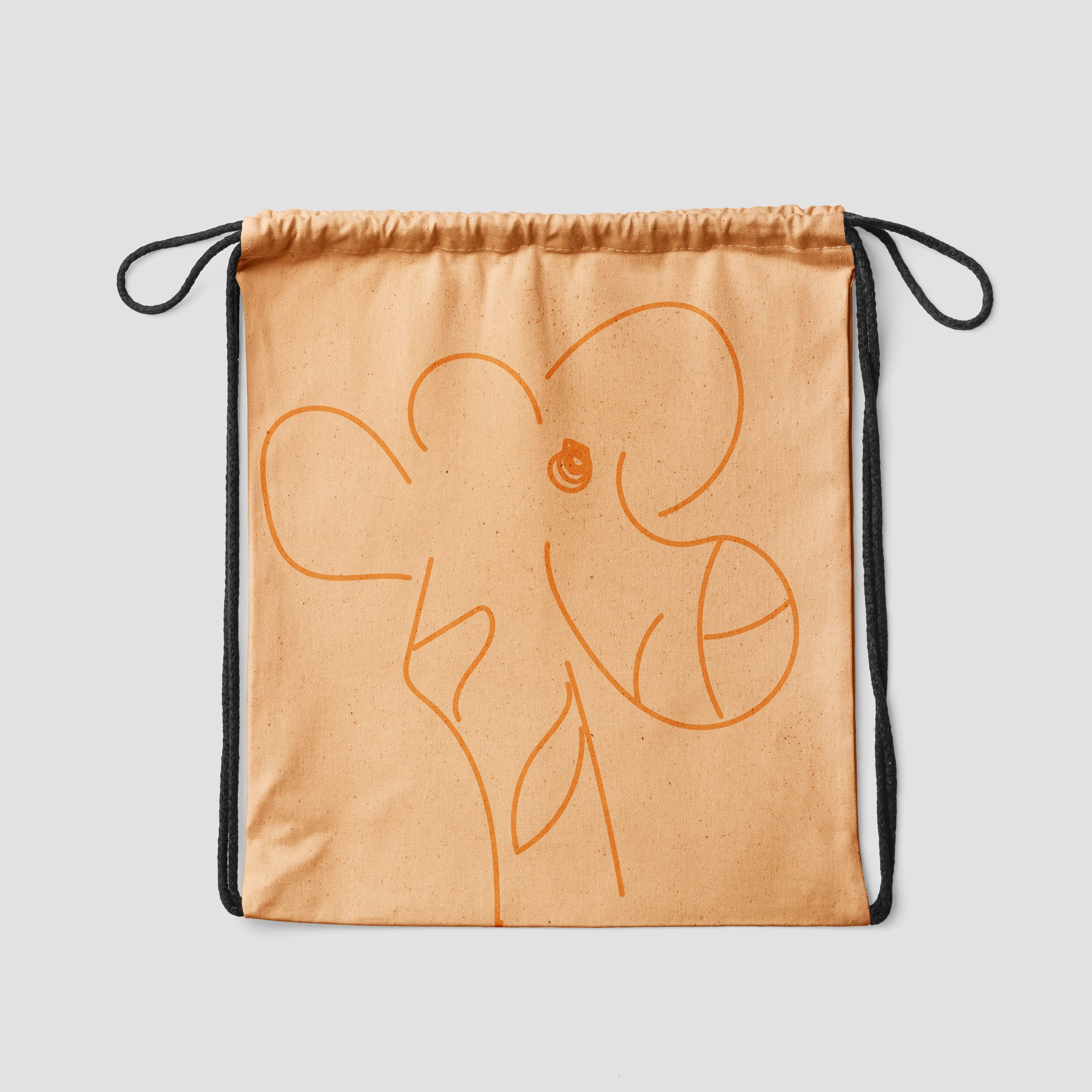
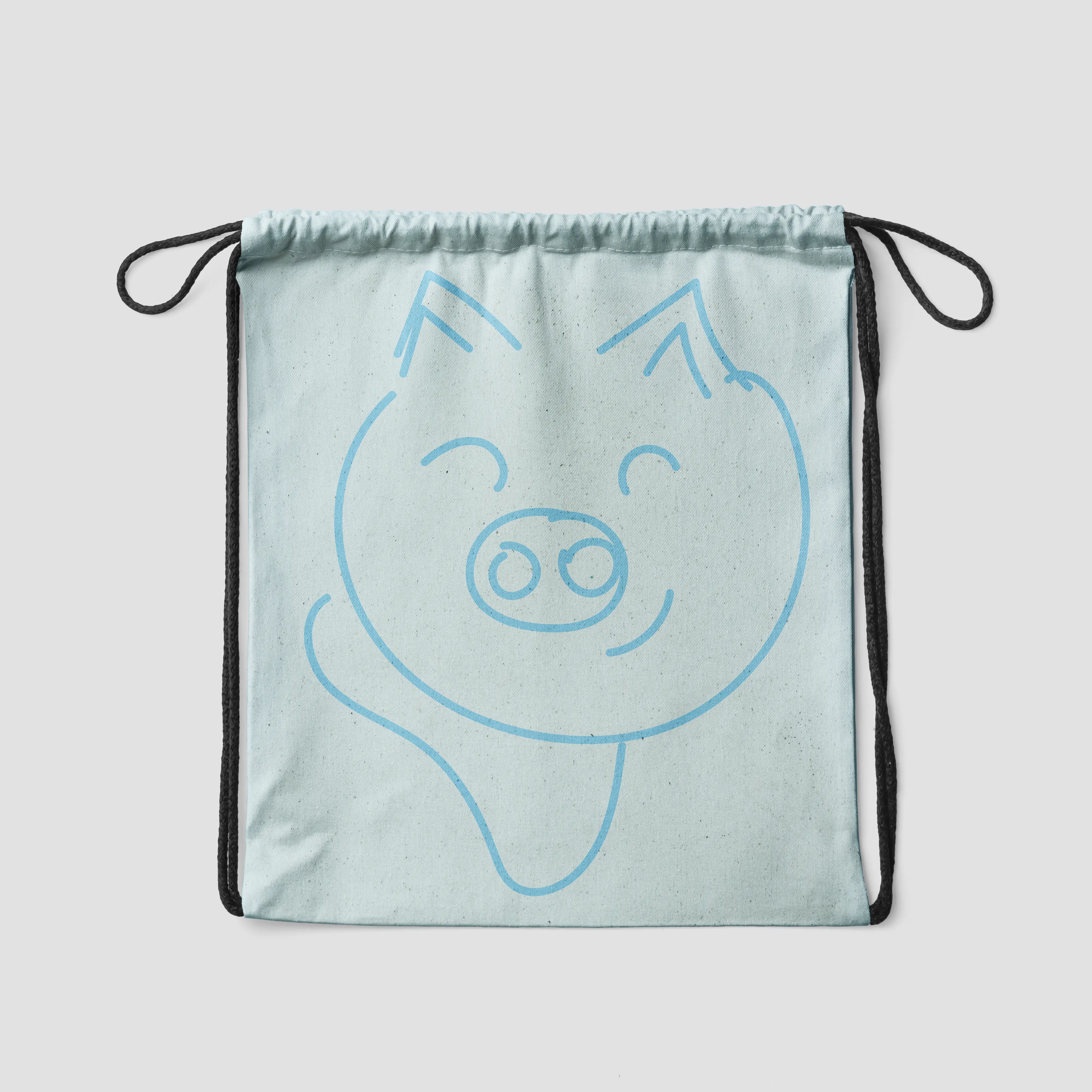
Based on the festival’s goal of being inclusive, the doodle itself had the potential to create something symbolic with a stronger meaning. Miniøya is a festival that opens up children’s imagination and creativity, and what better symbolizes this than a doodle?
To me, a doodle might be a face, while to you it might be an animal. Just like us, children’s imaginations are endless—and so is a simple doodle. Aiming to create a simple yet dynamic identity, I used this as a starting point and drew on the festival’s values to shape the new visual identity.


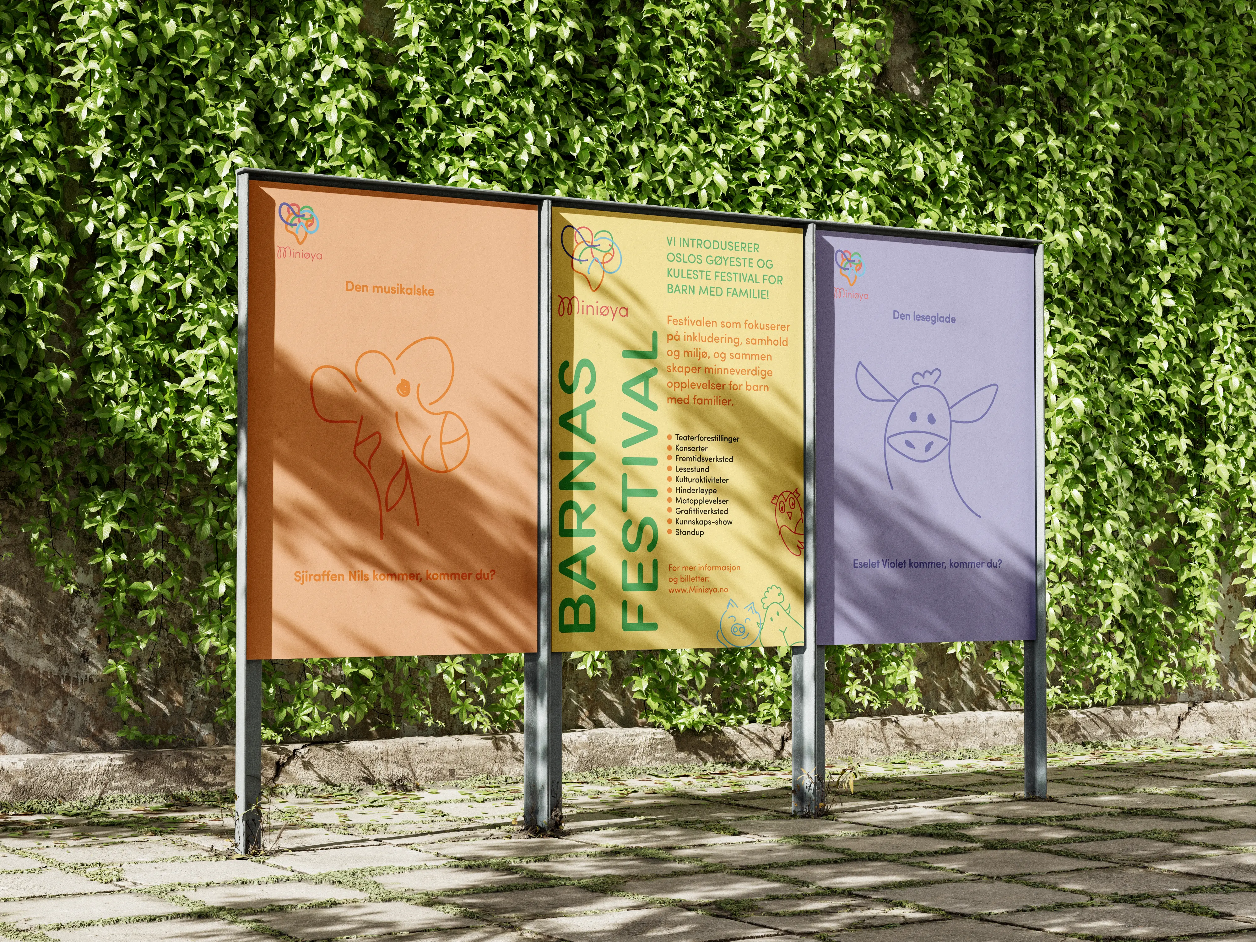
For the activites about the environment and helps to build small environmental activists that cares about our planet
Song, dance and music enthusiasts! Everything that includes this, entertains Nils the giraffe
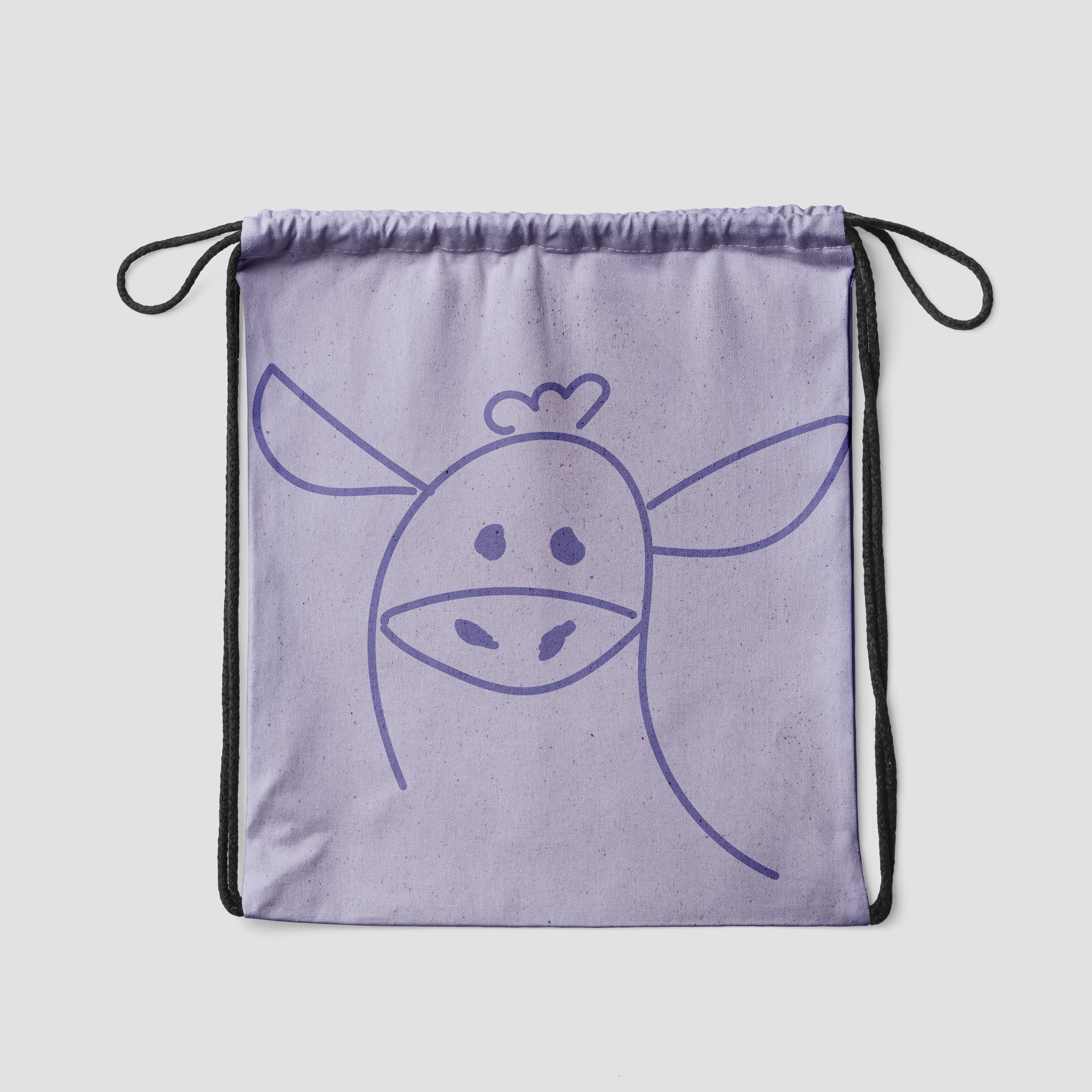
Everyone that loves books! Violet the donkey loves to read and tell stories
For the creative children, that loves to make things and create