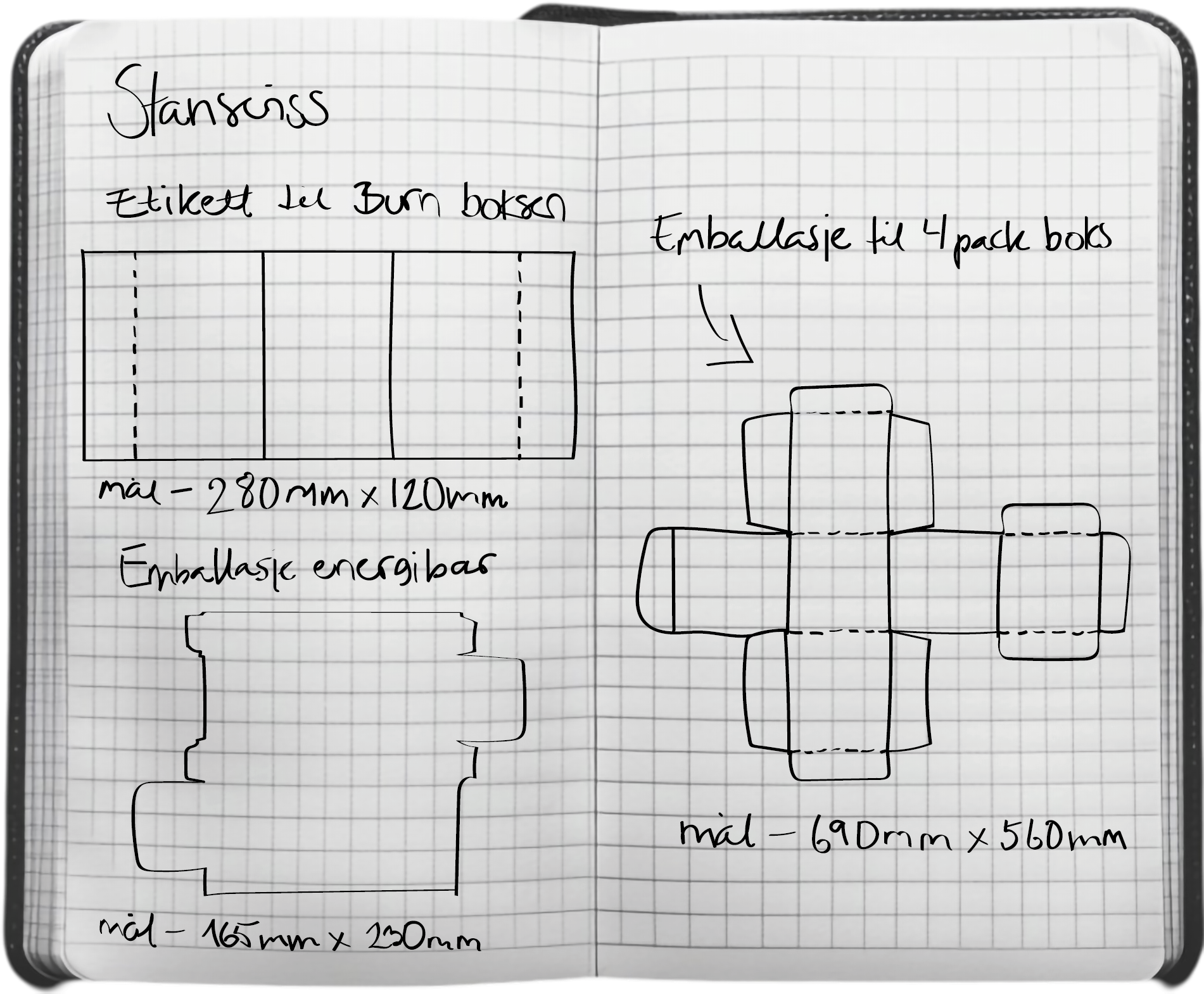
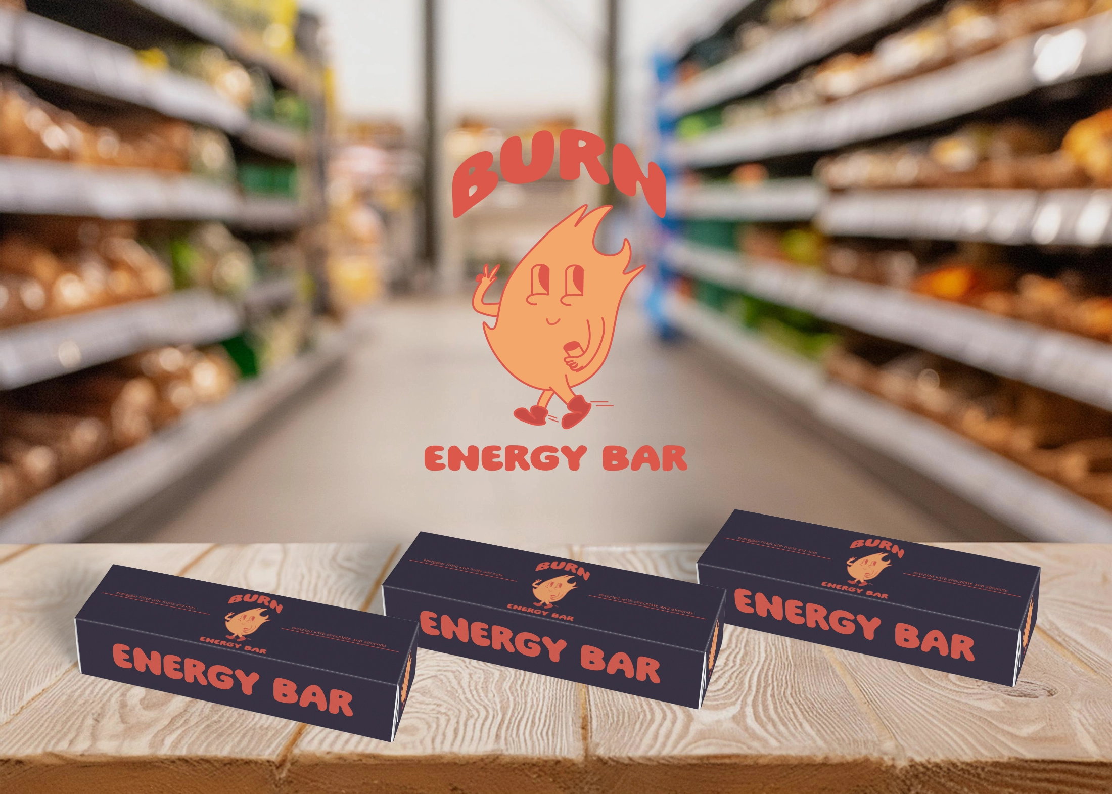
Redesign of Burn Energy drink package, as well as develope a whole new series of three new products - can label, packaging of four cans and energy bar.
Burn Energy
Fresh, trendy and playful
2024
Redesign a packaging and create a new series of three packaging products. Justify the redesign by focusing on factors such as an outdated design, changing customer needs, or environmental considerations. To ensure the success of the redesign, you must work strategically with insights, framework conditions, and an analysis of the existing product.
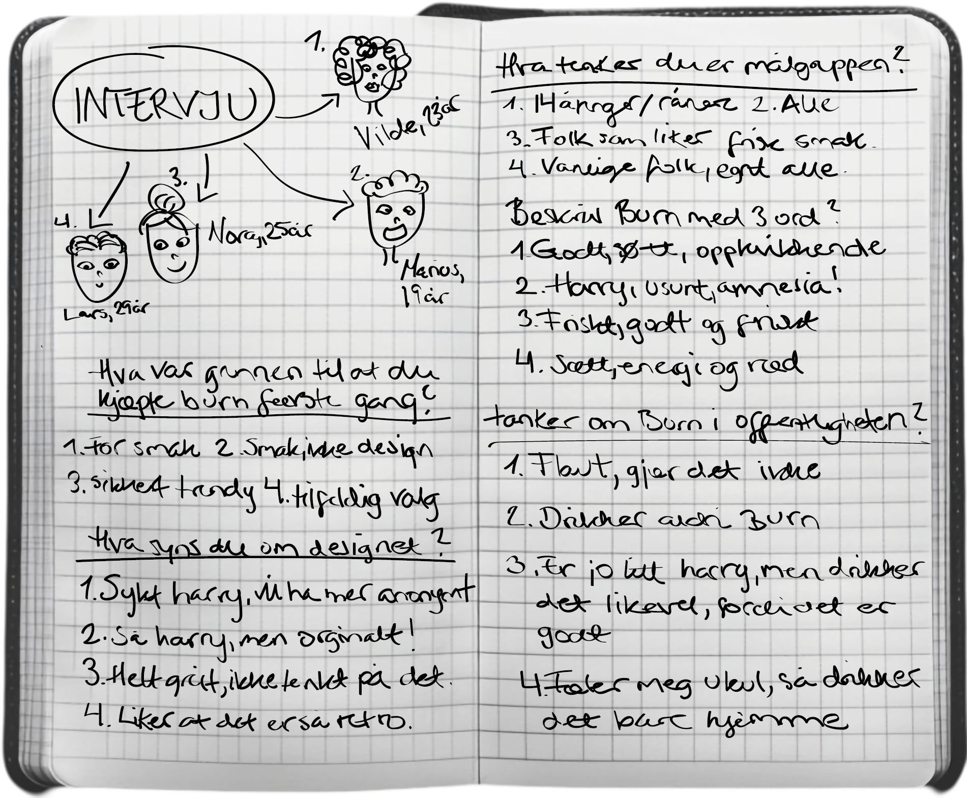
How can I redesign the packaging for Burn Energy Drink to expand its current target group to include young women in their twenties, while still preserving Burn Energy’s core essence and values?
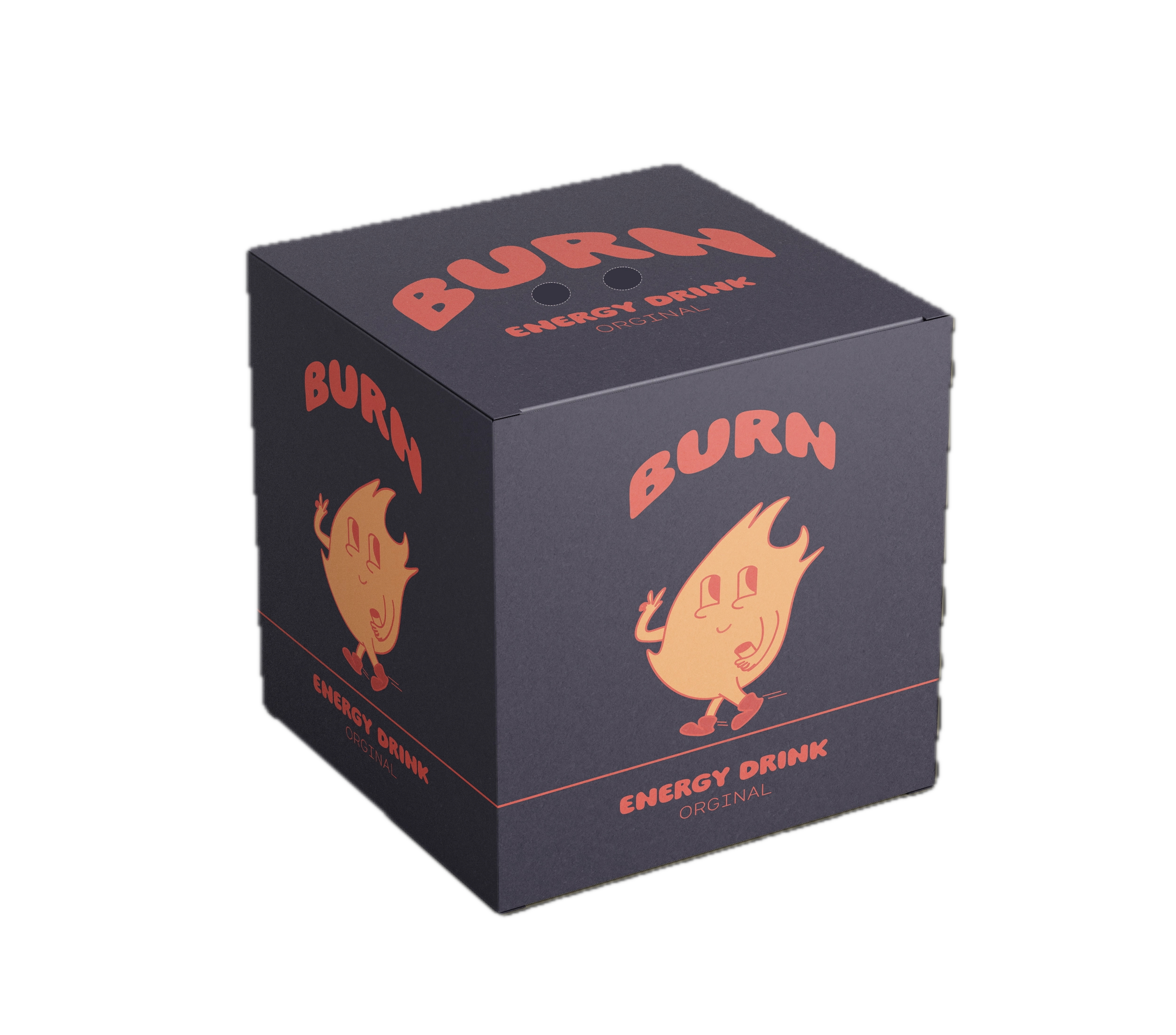


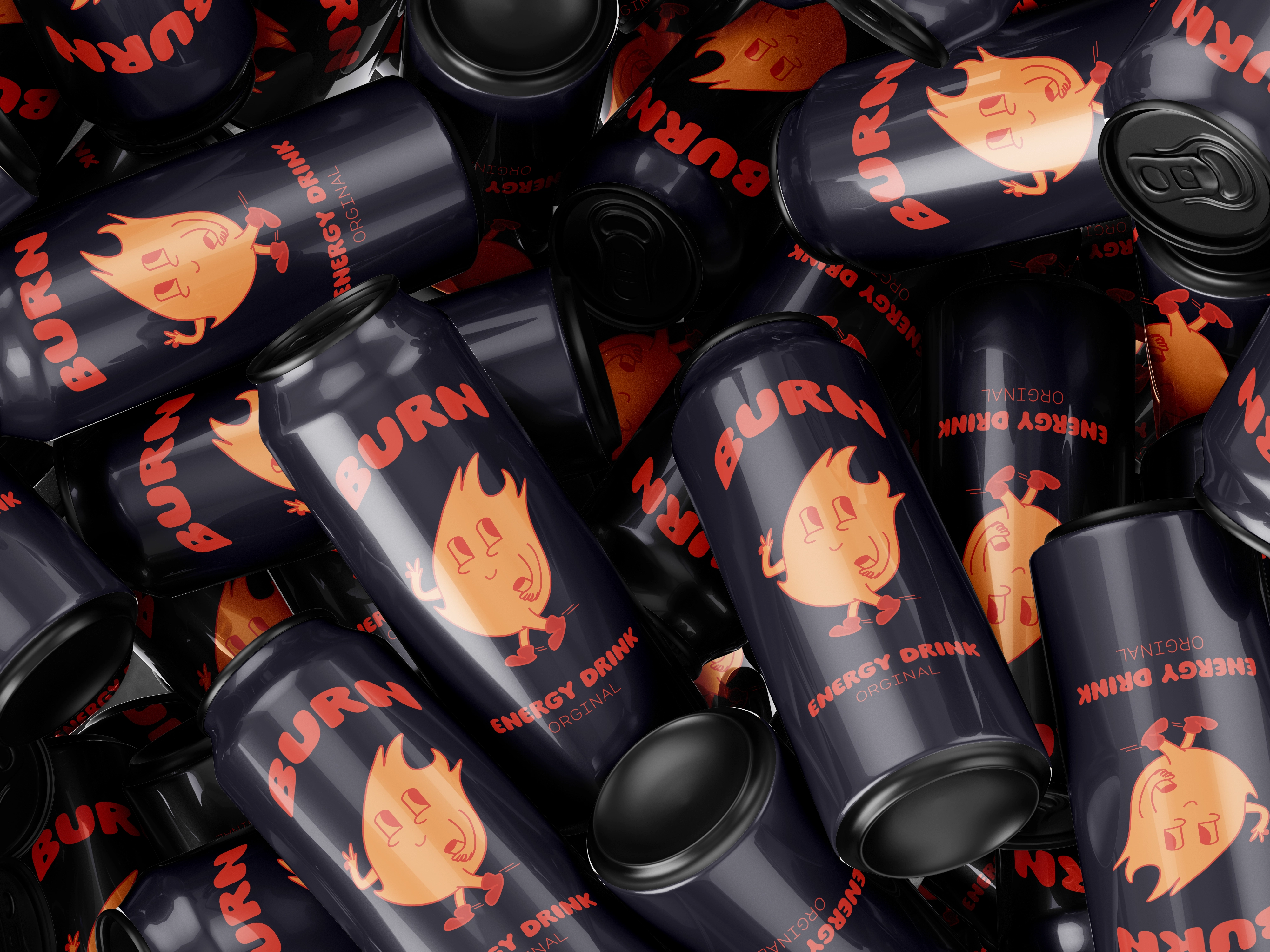
With the goal of expanding the primary target group to a broader audience, I developed and redesigned the packaging for Burn Energy. Inspired by the brand’s core values—fresh, trendy, and playfulI I drew inspiration from the 70s, incorporating warm colors like orange and red, along with “bubbly” and “psychedelic” typography.
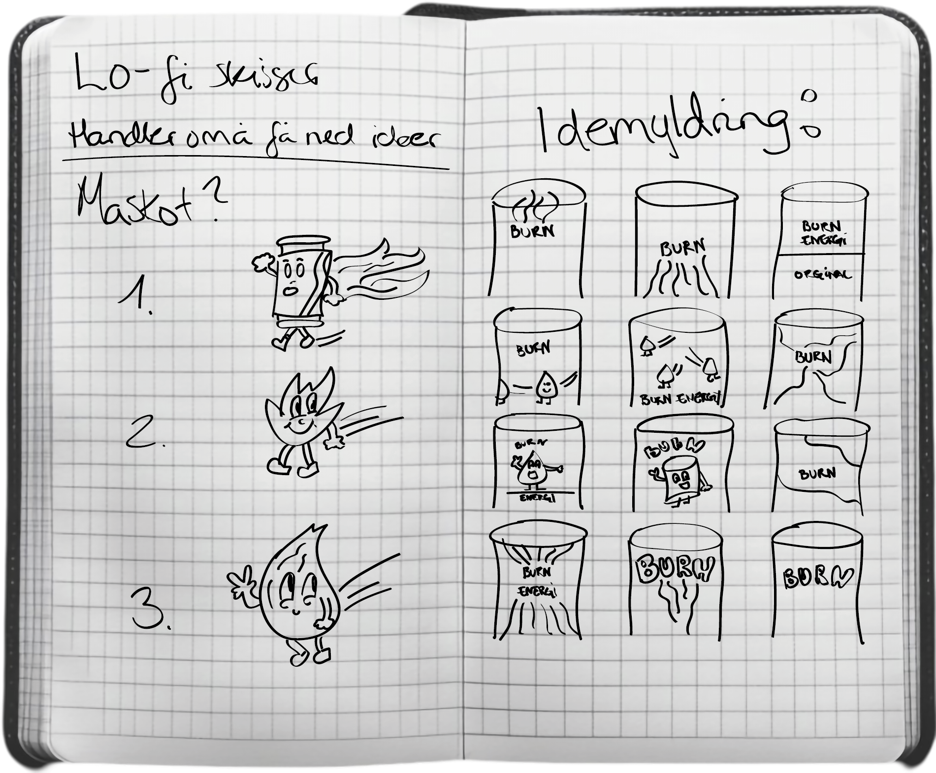
To ensure the design feels contemporary while strengthening the brand’s personality, I introduced a mascot. The mascot, a flame, ensures that the redesign remains recognizable and true to Burn Energy’s identity. This is an effective and distinctive way to connect with customers and evoke the desired emotional response. Additionally, the use of a mascot opens up more opportunities for marketing the product and enhancing its appeal.